


Ysobel™
Ysobel™图片
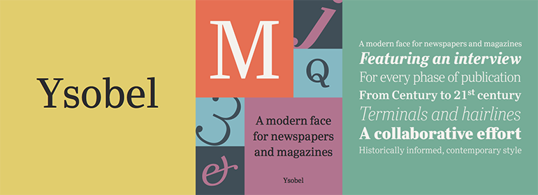
Ysobel™基础信息
- 字体品牌:Monotype
- 设计师: Nicholas,Robin; Savoie,Alice
- 字体分类: 衬线体、正文字体
- 字体属性: 外文
- 字符集: Unicode
- 发布时间:2018
Ysobel™字体介绍
The Ysobel™ typeface family is not only elegant; it is also exceptionally legible and space economical. A collaborative design effort between Robin Nicholas, as lead designer and project director, Delve Withrington and Alice Savoie of Monotype Imaging, the project had the primary design goal of creating a typeface family for setting text in newspapers and periodicals. The result, however, is also ideal for any application that requires quick and easy assimilation of text.
According to Nicholas, “The idea for the design started when I was asked to develop a custom version of Century Schoolbook. I wanted to give the design a more contemporary feel, although the client ultimately decided to keep their typeface closer to the original. The project nevertheless gave me ideas for a new design. Since designing Nimrod, some 30 years ago, I had wanted to make a more modern typeface family for newspapers and magazines – this seemed the ideal candidate.”
Ysobel (pronounced “Isabel”) has the soft, inviting letter shapes of Century Schoolbook but contrasts these with more incised serifs and terminals. Its capitals are also narrower than those of Century Schoolbook, and care was taken to ensure that they harmonize perfectly with the lowercase. Ysobel’s x-height is full-bodied without disrupting lowercase proportions. In addition, curved terminals, such as those in the “C,” “c” and “e,” were drawn more open as an aid to legibility and readability in text copy. Weight stress is near vertical, and hairlines are robust to ensure character fidelity in small point sizes.
Development began with the text version of the family, which has four weights, each with an italic companion. All weights feature lining and old style numerals, fractions, superiors and extended Latin language coverage. Small caps are also available in the Roman Regular design. Ysobel Display is a completely redrawn version of the typeface; it is narrower, and has a slightly smaller x-height, thinner hairlines and subtle design changes to improve its appearance when set at large sizes.
The Display Italic received particular attention to make it ideal for setting headlines, subheads and short blocks of copy. Changes include a slightly greater italic angle and more cursive treatment of some letter shapes. Alternative styles of capital “J” and “Q,” to provide variation, are available in all weights.
字体名称及英文名称
Ysobel Display Pro.TTF
Ysobel Pro.TTF
Ysobel Display Pro ExtraBold Italic.TTF
Ysobel Display Pro ExtraBold.TTF
Ysobel Pro Bold Italic.TTF
Ysobel Display Pro Bold Italic.TTF
Ysobel Pro Bold.TTF
Ysobel Display Pro Bold.TTF
Ysobel Pro SemiBold Italic.TTF
Ysobel Display Pro SemiBold Italic.TTF
Ysobel Pro SemiBold.TTF
Ysobel Display Pro SemiBold.TTF
Ysobel Pro Italic.TTF
Ysobel Display Pro Italic.TTF
Ysobel Display Pro Regular.TTF
Ysobel Pro Light Italic.TTF
Ysobel Display Pro Light Italic.TTF
Ysobel Pro Light.TTF
Ysobel Display Pro Light.TTF
Ysobel Display Pro Thin Italic.TTF
Ysobel Display Pro Thin.TTF
YsobelDisplayPro-Regular.TTF
YsobelPro-Regular.TTF
YsobelDisplayPro-ExtraBldIt.TTF
YsobelDisplayPro-ExtraBold.TTF
YsobelPro-BoldItalic.TTF
YsobelDisplayPro-BoldIt.TTF
YsobelPro-Bold.TTF
YsobelDisplayPro-Bold.TTF
YsobelPro-SemiBoldItalic.TTF
YsobelDisplayPro-SemiBoldIt.TTF
YsobelPro-SemiBold.TTF
YsobelDisplayPro-SemiBold.TTF
YsobelPro-Italic.TTF
YsobelDisplayPro-Italic.TTF
YsobelDisplayPro-Regular.TTF
YsobelPro-LightItalic.TTF
YsobelDisplayPro-LightIt.TTF
YsobelPro-Light.TTF
YsobelDisplayPro-Light.TTF
YsobelDisplayPro-ThinIt.TTF
YsobelDisplayPro-Thin.TTF
Ysobel™字体版本
1.000
Ysobel™字体下载地址

特别提示
1、本站资源来自网络收集,并不保证所有信息完全正确,如用于商业目的请自行仔细斟酌、查阅最新的版权信息。
2、如有侵犯您的版权,请及时联系,请来信978767986#qq.com(请将#换成@发送邮件),我们将尽快处理。