


DIN Neuzeit® Grotesk
DIN Neuzeit® Grotesk图片
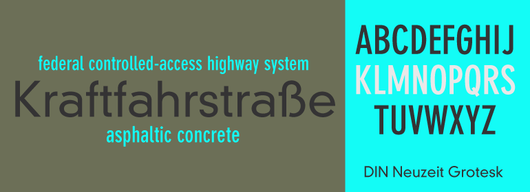
DIN Neuzeit® Grotesk基础信息
- 字体品牌:Linotype(Monotype)
- 设计师: 暂无
- 字体分类: 衬线体
- 字体属性: 外文
- 字符集: Unicode
- 发布时间:2018
DIN Neuzeit® Grotesk字体介绍
这款字体由Hermann Zapf为D. Stempel AG而设计,最初是打算作为他设计的Palatino字体家族的book或text粗细字体。1954年,这款字体却以Aldus的名称被单独发布。Aldus的特点是比Palatino更细更窄,这使得它成为书籍排版的理想选择,不过,Palatino也非常受欢迎。除了常见的book粗细外,Aldus还有其自己的斜体,小型大写字母及老式数字体。这款字体是以15世纪威尼斯印刷商及出版商Aldus Manutius的名字命名的。
Neuzeit Grotesk was originally designed by Wilhelm Pischner (1904-1989) and was released by the font foundry D. Stempel in 1928-1939. In 1970, the German Standards Committee advised the standard use of Neuzeit-Grotesk for official signage and traffic directional systems, and the abbreviation DIN was added to the name of the font. DIN" stands for Deutsches Institut für Normung (The German Institute for Industrial Standards). Neuzeit Grotesk was also once the standard in the German printing industry. It has been seen as a straightforward and utilitarian typeface, with no unusual or distracting features. Like other typefaces from the 1920s, it reflects the philosophy of those times, "Form is Function." Today, however, because of its familiarity and practicality, DIN Neuzeit™ Grotesk has acquired an almost cheerful and reassuring aura. Try it out for signage, magazine headlines, or flyers. See also Neuzeit S for text weights of Neuzeit Grotesk."
字体名称及英文名称
DIN 30640 Pro Neuzeit Grotesk Bold Cond.TTF
DIN 30640 Pro Neuzeit Grotesk Bold.TTF
DIN 30640 Pro Neuzeit Grotesk Light.TTF
DINNeuzeitGroteskPro-BdCond.TTF
DINNeuzeitGroteskPro-Bold.TTF
DINNeuzeitGroteskPro-Light.TTF
DIN Neuzeit® Grotesk字体版本
2.000
DIN Neuzeit® Grotesk字体下载地址

特别提示
1、本站资源来自网络收集,并不保证所有信息完全正确,如用于商业目的请自行仔细斟酌、查阅最新的版权信息。
2、如有侵犯您的版权,请及时联系,请来信978767986#qq.com(请将#换成@发送邮件),我们将尽快处理。