


Versailles™
Versailles™图片
Versailles™基础信息
- 字体品牌:Linotype(Monotype)
- 设计师: Frutiger,Adrian
- 字体分类: 衬线体
- 字体属性: 外文
- 字符集: Unicode
- 发布时间:2018
Versailles™字体介绍
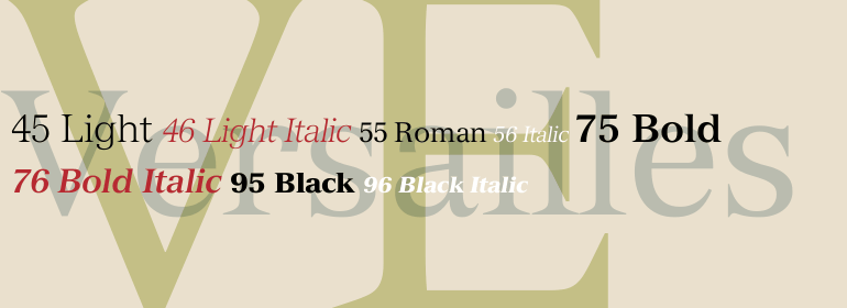
Versailles™是Adrian Frutiger于1984年为Linotype设计的。他是受1861年建造的巴黎歌剧院的设计师Charles Garnier纪念碑上的金属刻字的影响。这种字体被称为法文拉丁,特点是三角形衬线非常尖锐。Versailles字体让人想起那个时代和地方:它有一个对称且几乎垂直的轴;x字高很高,且衬线尖锐。这种锐度与新巴洛克风格的元素形成了鲜明对比,比如a、f、g、j和y上扁平但弯曲的悬垂。Versailles非常适合用于较短文本和标题。当使用大尺寸或较粗字重时,它可用于歌剧海报、网站以及广告横幅。
Adrian Frutiger designed Versailles™ for Linotype in 1984. He was influenced by lettering cut in metal on a memorial for Charles Garnier, the designer of the Paris Opera building in 1861. This style of lettering, called French Latine, is characterized by very sharp triangular serifs. The Versailles typeface evokes that time and place: it has a symmetrical, almost vertical axis; a tall x-height, and serifs so sharp they could draw blood. This sharpness contrasts nicely with neo-baroque elements such as the flat-but-curvy overhangs on the a, f, g, j and y. Versailles is perfect for shorter texts and titles or headlines. When used in large sizes or in the bolder weights, it has an astonishing impact. Let it perform on opera posters, websites and advertising banners.
字体名称及英文名称
Versailles LT Com 96 Black Italic.TTF
Versailles LT Com 95 Black.TTF
Versailles LT Com 76 Bold Italic.TTF
Versailles LT Com 75 Bold.TTF
Versailles LT Com 56 Italic.TTF
Versailles LT Com 55 Roman.TTF
Versailles LT Com 46 Light Italic.TTF
Versailles LT Com 45 Light.TTF
VersaillesLTCom-BlackItalic.TTF
VersaillesLTCom-Black.TTF
VersaillesLTCom-BoldItalic.TTF
VersaillesLTCom-Bold.TTF
VersaillesLTCom-Italic.TTF
VersaillesLTCom-Roman.TTF
VersaillesLTCom-LightItalic.TTF
VersaillesLTCom-Light.TTF
Versailles™字体版本
2.01
Versailles™字体下载地址
特别提示
1、本站资源来自网络收集,并不保证所有信息完全正确,如用于商业目的请自行仔细斟酌、查阅最新的版权信息。
2、如有侵犯您的版权,请及时联系,请来信978767986#qq.com(请将#换成@发送邮件),我们将尽快处理。