


ITC Scarborough™
ITC Scarborough™图片
ITC Scarborough™基础信息
- 字体品牌:ITC(Monotype)
- 设计师: Kobayashi,Akira
- 字体分类:
- 字体属性: 外文
- 字符集: Unicode
- 发布时间:2018
ITC Scarborough™字体介绍
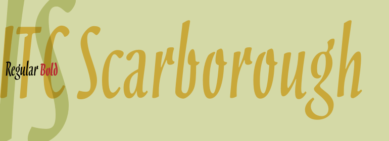
1998年,由小林章(Akira Kobayashi)设计的ITC Scarborough,让人联想起20世纪30年代广告中的字体。字体的特殊书写形式与字母之间没有联系,它遵循了当时的新闻标题和电影预告片中常用的毛笔字原则。小林章为他的字体选择了动态的形式,小而粗壮的笔划之间的对比。ITC Scarborough有常规粗体显示,最适合用于标题和短文本。
ITC Scarborough was designed by Akira Kobayashi in 1998 to be reminiscent of the typefaces in advertisements of the 1930s. The special written form of the font has no connection between the letters and follows the principles of the brush scripts often used in the headlines and film trailers of this time. Kobayashi chose dynamic forms for his font, small yet robust with contrast between the strokes. ITC Scarborough is available in regular and bold weights and is best used for headlines and short texts.
字体名称及英文名称
Scarborough ITC Bold.TTF
Scarborough ITC Regular.TTF
lt_70402.TTF
lt_70401.TTF
ITC Scarborough™字体版本
2.01
ITC Scarborough™字体下载地址
特别提示
1、本站资源来自网络收集,并不保证所有信息完全正确,如用于商业目的请自行仔细斟酌、查阅最新的版权信息。
2、如有侵犯您的版权,请及时联系,请来信978767986#qq.com(请将#换成@发送邮件),我们将尽快处理。