


ITC Manhattan™
ITC Manhattan™图片
ITC Manhattan™基础信息
- 字体品牌:ITC(Monotype)
- 设计师: Carnase,Tom
- 字体分类: 衬线体
- 字体属性: 外文
- 字符集: Unicode
- 发布时间:2018
ITC Manhattan™字体介绍
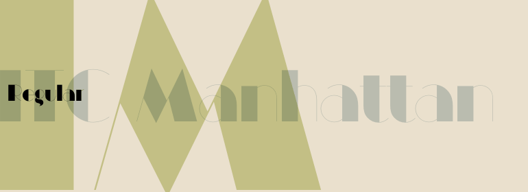
Manhattan was designed in 1970 for ITC by Tom Carnase, who also created Avant Garde Gothic. The distinguishing characteristic of this designer's work is found in the emphasis on the thick-thin constrast. In this case, Carnase approached the border of the impossible. The heavy vertical strokes stand opposite the finest of lines and the thick columns dominate the overall look. The basic forms are strictly constructed, as are those of Morris F. Benton's Broadway of 1925, to which many parallels can be found. Manhattan is best used for applications which will not be placed too far from the viewer, as at too great a distance the fine lines can no longer be seen. It should be used exclusively for headlines in medium point sizes.
字体名称及英文名称
Manhattan ITC Regular.TTF
LT_70301.TTF
ITC Manhattan™字体版本
2.002
ITC Manhattan™字体下载地址

特别提示
1、本站资源来自网络收集,并不保证所有信息完全正确,如用于商业目的请自行仔细斟酌、查阅最新的版权信息。
2、如有侵犯您的版权,请及时联系,请来信978767986#qq.com(请将#换成@发送邮件),我们将尽快处理。