


Simoncini Garamond™
Simoncini Garamond™图片
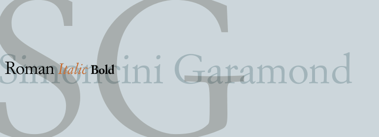
Simoncini Garamond™基础信息
- 字体品牌:Linotype(Monotype)
- 设计师: Simoncini,Francesco
- 字体分类: 衬线体
- 字体属性: 外文
- 字符集: Unicode
- 发布时间:2018
Simoncini Garamond™字体介绍
Claude Garamond (ca. 1480-1561) cut types for the Parisian scholar-printer Robert Estienne in the first part of the sixteenth century, basing his romans on the types cut by Francesco Griffo for Venetian printer Aldus Manutius in 1495. Garamond refined his romans in later versions, adding his own concepts as he developed his skills as a punchcutter. After his death in 1561, the Garamond punches made their way to the printing office of Christoph Plantin in Antwerp, where they were used by Plantin for many decades, and still exist in the Plantin-Moretus museum. Other Garamond punches went to the Frankfurt foundry of Egenolff-Berner, who issued a specimen in 1592 that became an important source of information about the Garamond types for later scholars and designers. In 1621, sixty years after Garamond's death, the French printer Jean Jannon (1580-1635) issued a specimen of typefaces that had some characteristics similar to the Garamond designs, though his letters were more asymmetrical and irregular in slope and axis. Jannon's types disappeared from use for about two hundred years, but were re-discovered in the French national printing office in 1825, when they were wrongly attributed to Claude Garamond. Their true origin was not to be revealed until the 1927 research of Beatrice Warde. In the early 1900s, Jannon's types were used to print a history of printing in France, which brought new attention to French typography and the Garamond" types. This sparked the beginning of modern revivals; some based on the mistaken model from Jannon's types, and others on the original Garamond types. Italics for Garamond fonts have sometimes been based on those cut by Robert Granjon (1513-1589), who worked for Plantin and whose types are also on the Egenolff-Berner specimen. The Linotype portfolio has several versions of the Garamond typefaces. Though they vary in design and model of origin, they are all considered to be distinctive representations of French Renaissance style; easily recognizable by their elegance and readability.
Simoncini Garamond® was designed by Francesco Simoncini from 1958 to 1961, and he based it on the Jannon model. This version works well for both text and display, and is a little lighter and more delicate that other Garamonds."
字体名称及英文名称
Simoncini Garamond LT Bold.TTF
Simoncini Garamond LT Italic.TTF
Simoncini Garamond LT Regular.TTF
LTe50664.TTF
LTe50663.TTF
LTe50662.TTF
Simoncini Garamond™字体版本
6.502
Simoncini Garamond™字体下载地址

特别提示
1、本站资源来自网络收集,并不保证所有信息完全正确,如用于商业目的请自行仔细斟酌、查阅最新的版权信息。
2、如有侵犯您的版权,请及时联系,请来信978767986#qq.com(请将#换成@发送邮件),我们将尽快处理。